← All work Case 07
Greenwheels is the top car sharing platform in the Netherlands. With no design team of its own, it came to us, and the work grew into a product ownership role shared with Greenwheels HQ.
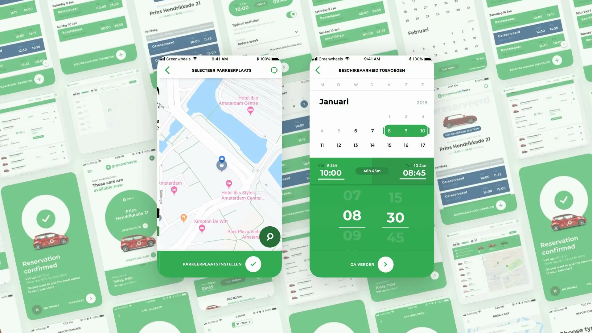
Challenge
Greenwheels had become the top car sharing platform in the Netherlands and was making moves in Germany. The app designed by our agency had already proved itself: after it launched in 2016, bookings in the app grew by 60%. The next step was to scale it, with new features and new kinds of customers, without a design team of its own.
Its users are split in two. Businesses need access to a fleet without the hassle of running their own. Private customers can be anyone from a family on a weekend trip to a student moving a couch home from IKEA. And many people are both.
Insight
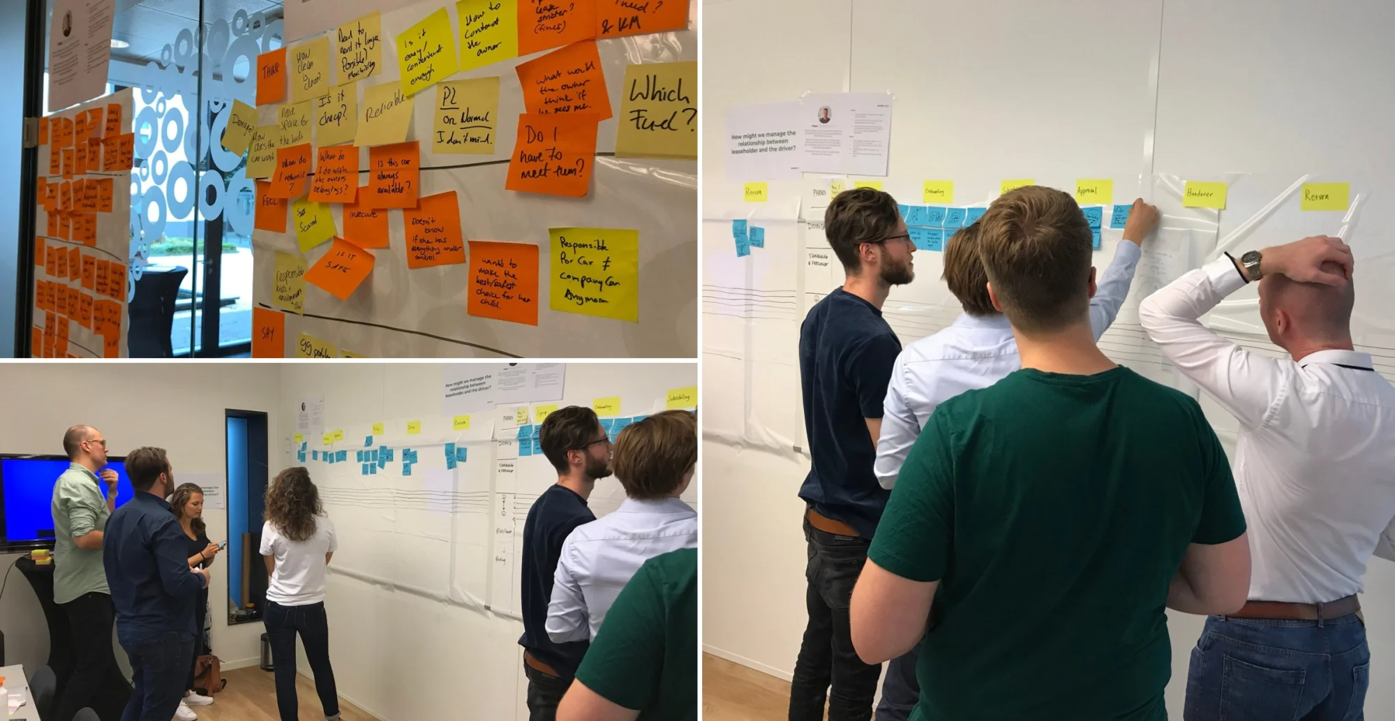
We ran diary studies, interviews, ride-alongs, surveys and workshops, and went through support tickets, then mapped the whole journey from discovering Greenwheels to inviting a friend. The frustration peaks were all where the technology showed through: logging in, finding and opening the car, reporting damage, ending a trip.
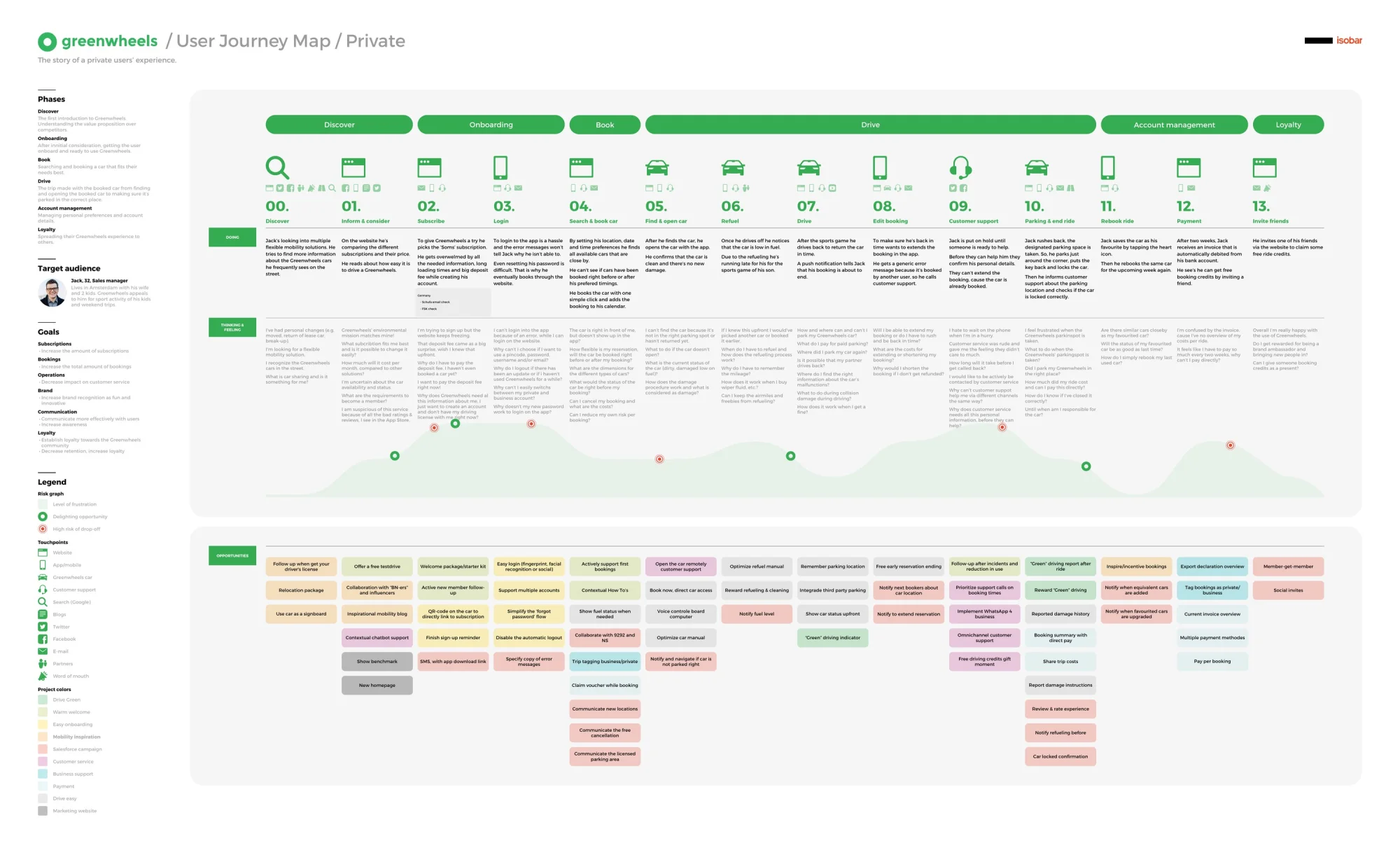
Behind every booking sit complex systems: electronic keys, fleet data, payments, damage claims. The job was to hide all of that behind an interface that feels like it gets out of the way, so users can focus on getting out on the road.
A design system
Features were being added faster than the app’s look could keep up, so I was an integral part of creating a modern design system for Greenwheels: a recognisable, branded set of patterns that is fun and engaging, but gets out of the way when the focus should be on the road.
Big, clear actions
Booking a car or reporting damage happens standing on the street. Large, simple actions replace complicated forms and endless pages.
One green language
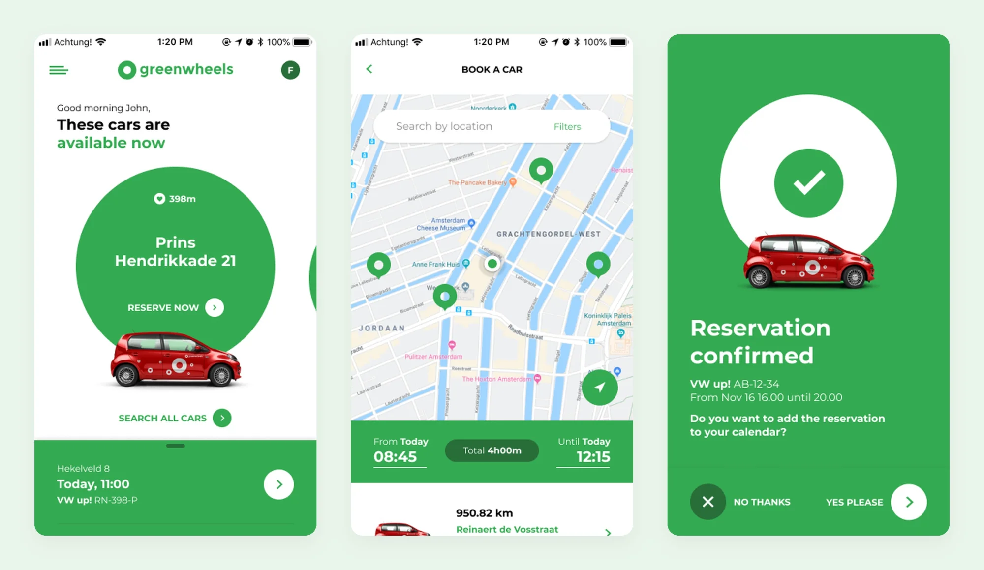
The green circle from the logo became the key element: the car you’re about to book, a confirmation, the next step. The same components carry across app and web.
Built to grow
Every new feature, from damage reporting to peer-to-peer rental, was built from the same pieces, so the app stayed consistent as it grew.
Your nearest or favourite car is the first thing you see, with how far away it is and one button to reserve it. Everything else is a search away on the map.
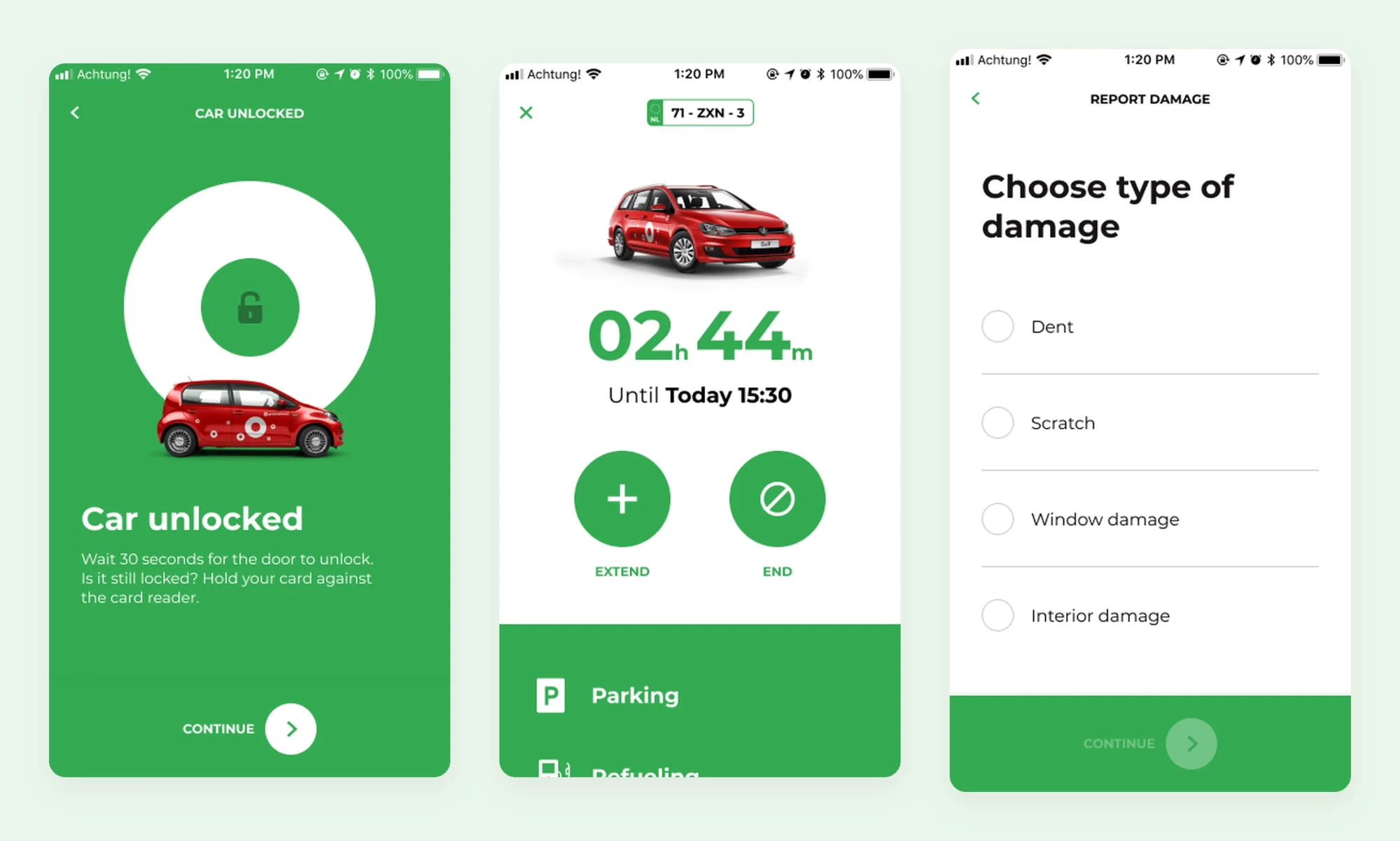
On the road, the app shrinks to what matters: unlocking the car, the time left with one tap to extend or end, and short, guided flows for things like reporting damage.
Multiple accounts
Many customers drive both privately and for work, often through mobility partners like NS Business or Shuttel. They had to log in and out to switch, and lost track of which booking belonged where. I led the design of multiple accounts: every account in one place, one switcher, and all upcoming reservations together.
How we worked
Over two years, I worked on concepting, research, UX and information architecture, interaction design and user testing, alongside the design team at Kraftwerk (now Dentsu Creative), with Label A building the apps. Workshops, scoping sessions, UX audits and regular reviews kept Greenwheels HQ close to the work, within legal requirements, many stakeholders and several platforms.
Outcome
Greenwheels gained a design system that let it keep adding features without losing its character, setting them up for success for a long and healthy product lifecycle.